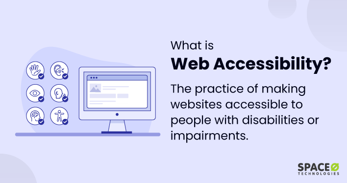
Web Accessibility Practices
Do not Use Aria unless…
- Use ARIA Sparingly
- Avoid excessive use of ARIA attributes; rely on semantic HTML whenever possible.
- Use appropriate HTML tags to structure UI elements, ensuring they convey their meaning without extra ARIA attributes.
- Only use ARIA to add accessibility details for custom UI components that aren't natively supported by HTML, like interactive widgets.
- Alerts and Notifications
- Use
aria-liveon dynamic content like toast messages or alerts to announce updates to screen readers.
- Use
HTML Native Elements First
- Avoid Using
<div>as a Button- Use
<button>for clickable elements to ensure they’re accessible and keyboard-navigable, instead of using<div>withonClick.
- Use
- Accessible HTML Tables
- Include
<caption>for table summaries and use<th>for table headers to enhance readability and structure.
- Include
Form
- Link Labels with Form Inputs
- Associate labels with form inputs using the
<label for="inputID">attribute. - If labels are visually unnecessary, consider using
aria-labeloraria-labelledbyon the input for screen reader users. - you should also add HTML autocomplete attributes to your fields. Adding autocomplete attributes allows a more fine-grained definition or identification of purpose to user agents and assistive technologies (AT).
- use aria-description or aria-described by to add addition info such as validation requirements
- Associate labels with form inputs using the
<input type="text" autocomplete="name">
<input type="tel" autocomplete="tel">
<input type="email" autocomplete="email">
- Use Autofocus Thoughtfully
- Use
autofocuson input fields sparingly and only where it won’t disrupt navigation or user experience.
- Use
Image
- Ensure images have descriptive
altattributes. - Avoid phrases like “image of” or “photo of,” as screen readers already identify the element as an image.
Page Layout and Structure
- Use Semantic HTML for Structure
- Build a semantic structure with tags that communicate the layout and function of each section.
- Examples:
- Use
<aside>for sidebars. - Use
<header>and<nav>for header and navigation. - Use
<h1>through<h6>tags for headings, reflecting hierarchy and not size.- Only one
<h1>per page, and maintain a logical heading order (e.g.,<h1>,<h2>,<h3>).
- Only one
- Use
<footer>for the page footer. - Use
<section>for partitioning different parts of the page content- Consider adding
aria-labelattributes for extra context on sections if needed.
- Consider adding
- Use
- Examples:
- Build a semantic structure with tags that communicate the layout and function of each section.
<header>
    <nav>...</nav>
</header>
<main>
    <section aria-label="Introduction to stamp collecting">
        <p>Stamp collecting, also known as philately, is the study of postage stamps...</p>
    </section>
</main>
<footer>
    <p>© 2024 - Stamps R Awesome</p>
</footer>
- Page Titles
- Structure page titles with the most specific information first.
- Don’t: “The Good Doctor | Season 3 | Episode 3”
- Do: “Episode 3 | Season 3 | The Good Doctor”
- Structure page titles with the most specific information first.
- Specify Page Language
- Use
langattributes to define the language of the page or sections of text in different languages.
- Use
<html lang="en">
  ...
  <p lang="et">Kas sa räägid inglise keelt?</p>
</html>
- Responsive Design and Zooming
- Ensure the website is fully functional and accessible at different zoom levels.
- A mobile-responsive design often helps meet this requirement.
- Keyboard Accessibility
- Verify that your site is fully navigable with keyboard-only input (e.g., Tab, Enter, and Space keys).
- Ensure interactive elements are focusable and usable without a mouse.
- Spacing and Clickable Areas
- Ensure clickable elements are adequately spaced to avoid misclicks.
- Buttons and links should be large enough for users to click without difficulty.
Border Outline
- Do not remove the default browser outline styles; instead, style the outline for consistency and accessibility.
/*--don't*/
:focus {
	outline: none;
}

/*-- better*/
:focus {
  outline: 3px dotted #008576;
}
Link
- Provide meaningful text in links, avoiding generic phrases like "Click here" or "Read more."
- If these phrases are necessary, use
aria-labelto add descriptive context.
<a aria-label="Read more about some awesome article title">Read More</a>
Video
- Video Accessibility
- Add Captions
- Provide captions to ensure multimedia content is accessible to users with hearing impairments.
- Searchable captions can further enhance usability, enabling users to jump directly to specific parts of the video.
- Captions, Subtitles, and Transcripts
- Captions: Text synchronized with multimedia content to represent spoken words and significant sounds for those who cannot hear.
- Closed Captions (CC): Can be toggled on or off by the viewer.
- Open Captions (OC): Permanently embedded in the video and cannot be turned off.
- Subtitles: Similar to captions but aimed at viewers who can hear the audio but may not understand the language. Typically used for translations in foreign-language content.
- Transcripts: A written version of multimedia content, including spoken words and sound effects. Useful for:
- Individuals with cognitive disabilities who prefer reading.
- Users who want to review or skim content at their own pace.
- Boosting search engine optimization (SEO) by making content indexable.
- Captions: Text synchronized with multimedia content to represent spoken words and significant sounds for those who cannot hear.
- Add Captions
- Audio Descriptions
- Narrations that describe essential visual elements in videos for users who are blind or have low vision.
- Extended Audio Descriptions: Pauses the video at intervals to provide additional time for detailed descriptions.
- Beneficial for people with cognitive disabilities who may need extra context.
- Sign Language Interpretation
- Provides narration of the audio portion of content through sign language for users who are deaf.
- Considerations:
- Incorporating sign language is expensive and time-consuming due to the diversity of sign languages (over 300 worldwide).
- Prioritize sign language for key videos with high audience demand.
- Screen Reader Compatibility
- Test audio elements to ensure they’re compatible with screen readers and offer alternative text when necessary.
Animations
- Provide User Preferences
- Offer options to disable animations, which can help users with motion sensitivity.
@media (prefers-reduced-motion: reduce) {
    /* Disable animations */
    * {
        animation: none !important;
        transition: none !important;
        scroll-behavior: auto;
    }
}
Typography
- Use Common Typefaces
- Choose widely recognized fonts such as Arial, Times New Roman, Calibri, or Verdana for better readability.
- Common fonts lead to faster reading and greater comprehension compared to uncommon or decorative fonts.
- Base Font Sizes and Scaling
- Use relative font sizes (e.g.,
%,rem, orem) to allow users to adjust text size according to their needs.
- Use relative font sizes (e.g.,
- Limit Typeface Variations
- Minimize variations such as color, bold, ALL CAPS, and italics to improve readability.
- Use alternatives like:
- Asterisks or dashes for emphasis.
- Highlighting or underlining specific words sparingly.
- Improve Text Comprehension
- Structure and Grouping: Organize text into meaningful sections to improve readability.
- Use headings, subheadings, numbered lists, bullet points, and quote blocks.
- Represent lists as actual list elements (
<ul>,<ol>) instead of inline text in paragraphs.
- Spacing and Line Height:
- Adjust spacing and line height (
line-height) for long paragraphs to make them less dense and easier to read.
- Adjust spacing and line height (
- Structure and Grouping: Organize text into meaningful sections to improve readability.
- Tools for Typography Accessibility
Testing Tools
- Use tools like Lighthouse, the WAVE accessibility checker, and ARIA DevTools to test and improve accessibility.
- Links:
- Lighthouse
- Disable mouse and try using the website to test keyboard accessibility
- ARIA DevTools
- Links: